Friday, December 14, 2012

Favorite Assignment of the Semester

I would have to say that my favorite assignment from this entire semester had to be the water color project. I would like to think of myself as somewhat of a pro at photoshop and illustrator, but this definitely showed me that there is more to the program that I had imagined. I really enjoyed to the fact that we can take photographs that contained enough detail and depth, and replicate them into what is virtually an electronic water color painting. Not to say that every assignment didn't require as much dedication, but this assignment in particular required at least 110% focus. First and foremost the outline of the photography had be next to flawless, otherwise the person would look like they had a weird growth coming out of their face, and defect, etc. The color pallet had to match up exactly with the original layer placed, or else the portrait would look like it had a bad tan. The assignment was a challenge in itself, because we had the lack of a physical mouse to paint the layers. Using the track pad was somewhat of a nightmare to overcome. Overall the assignment taught me how to pay even more attention to the detail that was being placed. One tiny mistake could become noticable. This assignment not only helped improve my skills in illustrator and as an artist as a whole, but it helped me become a better photographer. There are times that I often overlook details that could ruin what could be a perfect image, and now I tend to pay closer attention. Creative Commons License
This work is licensed under a Creative Commons Attribution-Noncommercial-No Derivative Works 3.0 United States License.

Color

A color that I am most drawn to is the color red. According to Color Wheel Pro, "red is the color of fire and blood, so it is associated with energy, war, danger, strength, power, determination as well as passion, desire, and love." [Color Wheel Pro ]. It is also described as "emotionally intense[, that] enhances [and] increases human metabolism, respiration rates, and blood pressure." When I view the color red I see endless examples of the aforementioned descriptions. I often associate red with anger and energy, and apply those emotions to my artwork. Red Amaryllis by Georgia O'Keefe
One of the pieces I chose is Georgia O'Keefe's "Red Amaryllis". I think it's a perfect representation of the color red and all the attributes that follow. The flower as a whole is supposed to represent love and affection, and the background provides a halo that looks as though it is on fire. The flower also looks like an explosion, which is and attribute to war, anger, and pain. The red dominates the entire canvas and flows out instead of consolidating itself into one central area of the canvas. 
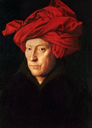
Man in a Red Turban by Jan Van Eyck
The second piece I chose is Van Eyck's "Man in a Red Turban". The art history world speculates that this is a potential self portrait of the artist himself, but there has not been any concrete information to back up the claim. I find myself drawn to this painting, because the entire image is a Renaissance painting of a man, but the entire pallet consists of dark, muted colors. The entire painting, with the exception to the man's face, is essentially black and the red adds a nice pop of color. The addition of red into the turban draws the viewer back to the painting, and makes one question the motive behind Van Eyck's decision to make the piece dark with a pop of red. Creative Commons License
This work is licensed under a Creative Commons Attribution-Noncommercial-No Derivative Works 3.0 United States License.

Monday, November 19, 2012

watercolor self portrait

Creative Commons License
This work is licensed under a Creative Commons Attribution-Noncommercial-No Derivative Works 3.0 United States License.

THIS happened!

ZOMGWTFBBQ!!11111 I got to sing with Joseph Gordon-Levitt! This was during the opening night of hitRECord on the Road- Nov. 13, 2012 Washington DC "we can still pretend that we can go back again..." Creative Commons License
This work is licensed under a Creative Commons Attribution-Noncommercial-No Derivative Works 3.0 United States License.

Sunday, October 21, 2012

Three artistic video critiques

"Life as a Terp" "The Traffic Warden" "the Elevator" The video I chose to critique is "the Traffic Warden", a film by Donald Rice. It documents a day in the life of a traffic warden in the UK, and how they are treated. Traffic wardens are not necessarily treated with much respect, and this particular man is definitely being kicked when he's down and out. This film also documents what could possibly be the worst day in ones life, and yet turn out to be the best. I chose this video particularly out of a bias; I LOVE David Tennant (the traffic warden), and it was just too easy. Going by the film being a traffic warden is almost like being a beat cop, you're the lowest of the low or you screwed up so bad that you got stuck with the job that no one wants. The film is a vignette about various people in this village, but centers around the traffic warden and a mother. It documents the eye witness moments that usually pass us by because we're in too much of a rush to get somewhere. It also shows how we mistreat each other, especially those in a position of authority. Clearly this traffic warden hates his job and hates his life, but at the end life works out in his favor. Creative Commons License
This work is licensed under a Creative Commons Attribution-Noncommercial-No Derivative Works 3.0 United States License.

Sunday, October 14, 2012

Bad website designs

Craigslist Craigslist is one of the top poorly designed websites. For a website that is designed to help people locate whatever it is they are trying to find, the site's main page is a large list. It's distracting to the viewer and derails one from completing their task at hand. Instead of looking for a free couch for their apartment, they are distracted by the "lost connections" page. The lack of graphics and detail makes the site look like an extremely underdeveloped site. Web Hamster Web Hamster is an epileptic nightmare. It is a reminder of the original hamster dance webpage from 1997, with its irritating but catchy song. It's a main page containing nothing but hamster GIFs simultaneously moving. There is no content, no information about anything, just rows of dancing hamsters. The website is designed to be a complete time waster, only providing entertainment to children or those under the influence. Amish Online Dating I came across this little gem while watching the show, "Breaking Amish". For those who are not supposed to have electronics, this poorly but hilariously design page is supposed to connect Amish singles. Trying to stick to a "classic" design, the layers or parchment scrolls provide a huge eyesore to the viewer. There is an explosion of terrible webcam photos with a cheap filter, and the variation of font sizes make it a bit distracting to even attempt to read the content. the Strand The website for the Strand, a bookstore in New York, is simply designed that provides straight to the point tabs. The main page contains staff picks that audience may be interested. There is an animate GIF that scrolls every 5 seconds advertising upcoming events, new releases, sales, etc. The hue choice is easy on the eyes, and is relaxing. Everything listed is separated in subsections on the main page, and the search is user friendly. The design is not made it overwhelm the viewer, but to bring added interest in the store. Creative Commons License
This work is licensed under a Creative Commons Attribution-Noncommercial-No Derivative Works 3.0 United States License.

Sunday, October 07, 2012

Gallery: in the making of....

So it just hit me that my gallery exhibit is in two weeks, and I still haven't gotten much started. I've produced photos, did a few test runs on the clay, and did some shopping for additional props. All was going according to plan until money came to a dead stop. Hurray for being broke #artstudentproblems. Come on, this definitely deserves a hash tag. So far I've produced this:
It was created with polymer clay and it was the best out of the tests. The image was rich in color and had a lot of clarity. Haig says that my images look like "warm, welcoming, terrorist hostage photos-but really cool!" Nice save. I wanted to create that sense of uncomfortableness, and no, I'm not being sarcastic. It's a long back story to my concept behind the topic, and that's best saved for another day. Here's round dos:
It was off to a great start. WAS. When I woke up the next day it looked like some creepy, faded image from a horror film. I was hoping after viewing a tutorial on youtube using the same concept, that my image would come out nicer. Nope. I kept contemplating that I added too much water, but I don't think this was meant to be. So polymer it is! Let's hope that everything else goes well, I can't afford (literally) to buy and test more mediums. Creative Commons License
This work is licensed under a Creative Commons Attribution-Noncommercial-No Derivative Works 3.0 United States License.

Annie Leibovitz

Annie Leibovitz creates photos that border along the lines of paintings. Her use of light and drama create a new world and a new sense of fantasy.
(image source: http://www.trbimg.com/img-502000e5/turbine/orl-disneyanniepics-pg-003/600) Leibovitz created a series of portraits for Disney; the photo above is of Johnny Depp as Captain Jack Sparrow. What I like about the photo is that the minimal light illuminates the prime areas, such as his face. The light also highlights the details within his attire without drowning out the image. The addition of the crashing, violent waves surrounding the character shows a realistic scene. The colors used in the costume are all similar, muted colors with the exception of the bandana. The bright color directs the viewer's eyes to the recognizable face, which in turn indicates that this is a promo for Disney. The one thing that did bother me a bit was the background. The whole theme of this particular photograph is supposed to be a storm. The sepia toned background doesn't indicate whether or not that the storm is happening or ending. The emotion and the stance of the character doesn't really match with the background. It's almost as though the character is oblivious to what's going on. The cropping of what seems to be the "ship" is a bit awkward; from the angle in which the photographer shot it looks like a plank with lines.
(image source: http://1.bp.blogspot.com/-zwEQunufMEA/TVXn3QyvtHI/AAAAAAAAAbU/0o-VT0btzsE/s1600/annie_leibovitz700_33742b.jpg) This image is of Nicole Kidman on a stage. The mass lighting creates a gorgeous background in this old theater. The way the light accents her dress makes it look as though she is floating on a cloud. Although Leibovitz mostly shoots celebrity portraits, the way she tilts Kidman's face plays upon the idea that the model doesn't need to be identified, just look at the image. It's like she is trying to say that she doesn't want the photo to be praised because she shot this fantastic image of Kidman, but for the fact that she shot this beautiful image. The only critique that I can point out about this photo is the unnecessary background "noise". The behind the scenes stage doors and curtains are a bit distracting to the image. The bare walls and the open doors take away from the classiness of the image. It turns the image into a journalistic shot instead of a portrait. If the image was cropped down to where the only thing in the background was the lighting and the empty seats, it would produce an even better image.
(images source: http://www.anglonautes.com/voc_pol_main/voc_pol_uk_monarchy_1/voc_king_pic_elizabeth_2_white.jpg) The final image is of Queen Elizabeth take in 2007. She was the first American photographer to be commissioned by the Queen to take a series of portraits. The portrait is well light and have a narrative attached. The commissioned work was to show "a day in the life of Queen Elizabeth", but it shows the Queen taking a typical monarch photo with a slightly more relaxed setting. I wouldn't say that this is so much of a critique, but more of a generalization; the lighting that Leibovitz uses in the image sets a foreboding feeling. Coming through the window shines a slightly overcast sun, illuminating one half of her body. The other half is fading into the room, as though she is blending in. The narrative that is attached could be the acknowledgement that her personal reign is slowly coming to an end, and it is beautifully represented. Creative Commons License
This work is licensed under a Creative Commons Attribution-Noncommercial-No Derivative Works 3.0 United States License.

Three illustrators

Takashi Murakami
Murakami is known for his love of the Japanese toys and the culture behind it, so his illustrations center around that. His use of bright colors and symetrical shapes draws the attention of the viewer to take a look at what is going on in the image. Although there is no concrete explaination of what is going on, the smaller illustrations flow well with the shapes, sizes, and colors. One thing I must admit that I do not like about his work is that his images become nauseating after a while. The more you look at one of his illustrations, the more dizzy you become. Daniel Clowes
The second illustrator is Daniel Clowes. He is known for his graphic novels, one of the most well known novels being "Ghost World". What I like about his illustrations is that they look almost like a demented "Family Circus". The characters all have similar facial attributes, where they almost come off as androgynous. The only thing that indicates that they are male or female are the jawlines, and the fact that the women in his graphic novels have more curvatious bodies. They remind me of a pulp fiction illustration; kind of a like a "Big brother " propoganda poster with modern actions and phrases. Roy Lichtenstein
Roy Lichtenstein took what is now known as "comic book illustrations" and made it into fine art. I appreciate the fact that he was able to replicate detail for detail the fine lines and colors that are typically found in comic prints. He made his large format images and created a hand drawn and painted rasterised image. He took what Seurat created years before with the concept of stippling, and made the dots into a larger format. His illustrations gave the viewer the opportunity to see what the fine detail really looks like within a comic book page. Creative Commons License
This work is licensed under a Creative Commons Attribution-Noncommercial-No Derivative Works 3.0 United States License.