Takashi Murakami
Murakami is known for his love of the Japanese toys and the culture behind it, so his illustrations center around that. His use of bright colors and symetrical shapes draws the attention of the viewer to take a look at what is going on in the image. Although there is no concrete explaination of what is going on, the smaller illustrations flow well with the shapes, sizes, and colors. One thing I must admit that I do not like about his work is that his images become nauseating after a while. The more you look at one of his illustrations, the more dizzy you become.
Daniel Clowes

The second illustrator is Daniel Clowes. He is known for his graphic novels, one of the most well known novels being "Ghost World". What I like about his illustrations is that they look almost like a demented "Family Circus". The characters all have similar facial attributes, where they almost come off as androgynous. The only thing that indicates that they are male or female are the jawlines, and the fact that the women in his graphic novels have more curvatious bodies. They remind me of a pulp fiction illustration; kind of a like a "Big brother " propoganda poster with modern actions and phrases.
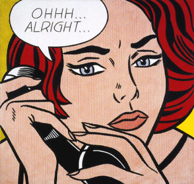
Roy Lichtenstein

Roy Lichtenstein took what is now known as "comic book illustrations" and made it into fine art. I appreciate the fact that he was able to replicate detail for detail the fine lines and colors that are typically found in comic prints. He made his large format images and created a hand drawn and painted rasterised image. He took what Seurat created years before with the concept of stippling, and made the dots into a larger format. His illustrations gave the viewer the opportunity to see what the fine detail really looks like within a comic book page.

This
work is licensed under a
Creative Commons Attribution-Noncommercial-No Derivative Works 3.0 United States License.


No comments:
Post a Comment